Monday, May 11, 2015

Assessment Task 2: Hero Shots

The mandelbrot set mathematical function suggests a mind blowing chocolate experience.

The light-driven electronic circuit suggests an efficient government

Sky's the limit for your golf skill development with Weymouth Links

The raw ferocity of the Tasmanian Devil is captured in this full screen shockwave

A different place for every kind of archetype, everyone loves their home.

Monday, May 4, 2015

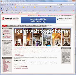
Assessment Task 1: Populating a Web Page Wireframe

I wanted a little more area to work in; higher res, so I expanded the original to 2000 pixel width

Task12: Capturing Motion


In the absence of compelling subjects or quality imaging equipment I have opted to capture on-screen motion.

Thursday, April 30, 2015

Task 11: png transparency


As you can see, the logo itself is very basic. I just used the gradient tool and filled a text selection.

Task 10: Backgrounds for the web

The photo is very important in painting a picture of the role of the charity fund that the site promotes.

Joe Rogan's in your face style of new media discussion is perfectly exemplified in this close up image,

Louis CK, my favourite comic. I like this image. Having a lower saturation level in the background image really makes the foreground pop.


This is an overwritten version of the repeating single line background


This is my tiled background. Basically I just created a mirror image vertically and horizontally, and just used a clone in the centre. When using tiled backgrounds, you need to be conscious of how the edges will marry up against each other.

Sunday, April 19, 2015

Task 9


Using separate photos to create a collage with shape and layer effects. Pin light and Vivid light respectively. 

png24 725k

jpg 141k

gif 328k

Wednesday, April 8, 2015

Task 8: jpg compression

Ok, so I was asked to talk about why these two photographs would have a different filesize, given that they have the same number of pixels, ostensibly taken by the same camera.


Even though they have the same number of pixels, they have differing volumes of colour information. In the top photo, there are many different colours, blues, terracotta, beige, green, it runs the full gamut of the rainbow, but in the bottom picture, the vast majority of the space in the picture is a very discrete colour palette; less unique colours are required to make up the image.

To demonstrate this effect, I have taken two photos of my own.

This is a shot of the road and nature strip in a suburban area near Hobart.

This is simply the tripod I use for a webcam in my room
The top photograph is nearly double the data size of the bottom, due to the multitude of colours required, and the way that jpg compressions pares down a colour palette to its barest elements. The bottom shot has at root only two actual hues, the rest is merely lightsourcing.

In regard to the kind of photo that would best suit the citycar, and keep the filesize as small as possible (a white car) we would want to capitalise on the colours already in use.

One of two approaches would work well. Firstly, you could simply take any detailed photo and desaturate and raise contrast to give it a black and white background, which will scarcely vary from the existing palette. The other option would be to go for an overcast sky and a stretch of road, greys and whites. An unsuitable image to use would be one in which you had perhaps some sort of tropical or garden environment, where you have a multitude of bright colours. The more colours needed, the larger the data size will be.